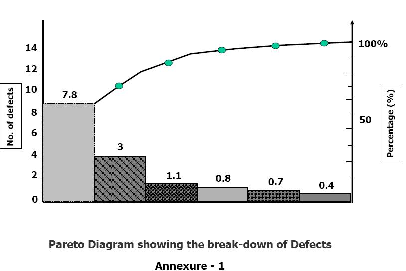
Pareto Diagram
Pareto Diagram is a tool that arranges items in the order of the magnitude of their contribution, thereby identifying a few items exerting maximum influence. This tool is used in SPC and quality improvement for prioritising projects for improvement, prioritising setting up of corrective action teams to solve problems, identifying products on which most complaints are received, identifying the nature of complaints occurring most often, identifying most frequent causes for rejections or for other similar purposes.
The origin of the tool lies in the observation by an Italian economist Vilfredo Pareto that a large portion of wealth was in the hands of a few people. He observed that such distribution pattern was common in most fields. Pareto principle also known as the 80/20 rule is used in the field of materials management for ABC analysis. 20% of the items purchased by a company account for 80% of the value. These constitute the A items on which maximum attention is paid.
Dr.Juran suggested the use of this principle to quality control for separating the "vital few" problems from the "trivial many" now called the "useful many".
Procedure :
The steps in the preparation of a Pareto Diagram are :
- From the available data calculate the contribution of each individual item.
- Arrange the items in descending order of their individual contributions. If there are too many items contributing a small percentage of the contribution, group them together as "others". It is obvious that "others" will contribute more than a few single individual items. Still it is kept last in the new order of items.
- Tabulate the items, their contributions in absolute number as well as in percent of total and cumulative contribution of the items.
- Draw X and Y axes. Various items are represented on the X-axis. Unlike other graphs Pareto Diagrams have two Y-axes - one on the left representing numbers and the one on right representing the percent contributions. The scale for X-axis is selected in such a manner that all the items including others are accommodated between the two Y- axes. The scales for the Y-axes are so selected that the total number of items on the left side and 100% on the right side occupy the same height.
- Draw bars representing the contributions of each item.
- Plot points for cumulative contributions at the end of each item. A simple way to do this is to draw the bars for the second and each subsequent item at their normal place on the X-axis as well as at a level where the previous bar ends. This bar at the higher level is drawn in dotted lines. Drawing the second bar is not normally recommended in the texts.
- Connect the points. If additional bars as suggested in step 6 are drawn this becomes simple. All one needs to do is - connect the diagonals of the bars to the origin.
- The chart is now ready for interpretation. The slope of the chart suddenly changes at some point. This point separates the 'vital few' from the 'useful many' like the A,B and C class items in materials management.
Pareto Diagram